 |

|
||||
Visualizing the Curse
|
||||
|
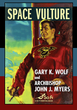
To produce the Space Vulture cover illustration, famed illustrator Glen Orbik and his partner Laurel Blechman worked with TOR’s art director Irene Gallo. To give the artists a sense of the story, Irene first sent them a brief synopsis. After they’d read that, and asked for more, she offered to send them the entire manuscript. “We gave her an enthusiastic ‘Yes!’” says Glen. “We always like to have as much information as possible about the story we’re illustrating. We want to get all the facts. Especially if it’s science fiction where all sorts of unusual things happen. Reading the whole manuscript also helps us get the flavor of the book. It all goes to better conceptualizing what the illustration should portray.”
“Our impression of Space Vulture,” Glen continues, “was that it had a fun, old-time, pulp style along the lines of my favorite Flash Gordon serials. We wanted the cover illustration to convey that feeling. We have a huge reference collection of pulp art imagery from the 1930’s through the 1950’s which we use for inspiration. We started by going through that. We also looked at the Space Hawk book which the two writers mentioned as their childhood inspiration.”
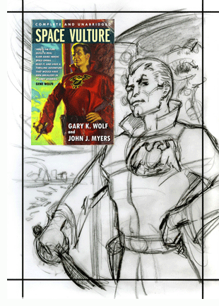
Irene suggested that their illustration show Space Vulture’s first encounter with the heroes. Glen says, “We sketched up several variations and sent her our favorites. One was an overview scene showing Space Vulture's ship, the Talon, swooping down on our hero Captain Corsaire, his buddies Cali and her boys, and Corsaire’s prisoner Gil Terry. The writers’ wacky description of Gil Terry with his one cricket leg and telescoping dung beetle eye was a pretty enticing visual.” Ultimately a close up sketch of the villain won out. According to Glen, “Originally I had hoped to show a bit more of Space Vulture's ship but this close up version allowed us to really zoom in and focus on the villain with very little distractions. Which of course is precisely the way Space Vulture himself would want it!”
As Glen went through the manuscript, he jotted down some key descriptive words or terms to remind himself of the authors' intent. He came up with "noble height", "inner core of cruelty", and "masterpiece of form". After going through the story and his word list he began to realize that he was being given the opportunity to paint the Biggest Baddie in the Universe.
|
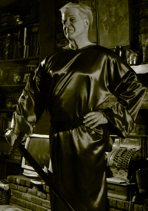
Glen continues. “Luckily, we knew the perfect model, except on this planet, he's a blonde. Laurel and I discussed some details, and then she designed and created Space Vulture's costume. Our model, a former Warner Bros. animator and history buff, even brought his own swords so we didn't have to rent one.”
The artists did a black & white sketch to work out the lighting. Then they photographed their model in an appropriate pose. Glen later idealized and redrew the model to look more like the actual Space Vulture character.
The artists next shot some reference pictures of various metal objects mostly from their kitchen. These objects helped them envision the form of the ship.
They researched their reference material to come up with a suitable planetary background.
Glen says, “I did a small color rough about three inches by five inches to work out the color scheme and to use as a working guide. Then I did the final painting in oil on a large gessoed illustration board.
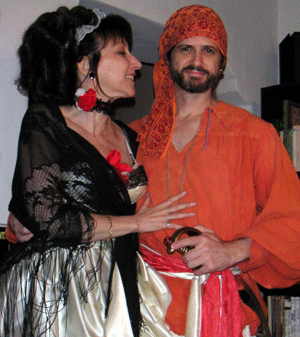 Laurel Blechman and Glen Orbik modeling for one of their own cover illustrations. |
“It often takes longer to plan and do studies for a cover image than it takes to actually paint the final art,” says Glen, “but in the end it's always worth it.”
As it certainly was here.
Click here to see more artwork from talented Space Vulture cover artist Glen Orbik.
| The Book | The Story | The Characters | Two Boys | The Authors | The Origin | New Pulp Traditions Articles | Reviews | The Sonic Room | Purchase | Contact Us © 2007-2011 Gary K. Wolf and Archbishop John J. Myers. All rights reserved. Privacy Policy |
