 |
|


|
||||
Producing a Classic
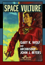
Next came the important job of designing the book jacket. The cover had to perform several crucial marketing and sales functions. It had to give potential readers an intriguing idea of the kind of story inside. Its subject matter and style had to convey a sense of the book’s pulp fiction heritage. It had to be extremely eye-catching, able to successfully compete for attention with the hundreds of other books lining bookstore shelves. That complex and difficult design task went to Peter Lutjen, Senior Designer at TOR. “I had a great head start on this jacket,” says Lutjen. “Irene Gallo, Tor's Art Director, had admired artist Glen Orbik's work in Spectrum and for the Hard Case Crime series. She realized that he'd be perfect for this project.” Gallo commissioned Orbik to do the art. “Irene was right,” Lutjen continues. “Glen produced a terrific painting. In style and execution it was exactly what we wanted.” Art in hand, Lutjen began his design process by accumulating a number of modern retro-futuristic typefaces that he thought might be appropriate. Using these, he did a number of preliminary layouts. Lutjen explains what happened next. “Something wasn't right. Everything I came up with seemed to have a 1970s feel, several decades newer than what I wanted. I realized I needed to actually go back in time and take a closer look at the original source material. “Flipping through pages of reproductions of original pulp SF novels, I began to notice an interesting fact. In contrast to the dramatic and often lurid artwork, the type the novels used was generally fairly conservative, simply set in a conventional sans-serif face. The two typefaces used on Space Vulture, Franklin Gothic (for the title type,) and Futura (for all additional copy — author names, quotes, flap copy, etc.) popped up pretty often in the old originals. Whether those pulp-era designers used those type styles so as not to compete with the artwork or because they felt those styles expressed a sense of the future I can’t say. Whichever, this approach definitely worked.” Once Lutjen settled on the typefaces, he did another interesting bit of cover design. He graphically distressed the artwork around the edges to suggest the distinct signs of age and the well-worn look original pulp novels and magazines acquire after having spent the last several decades piled on the floors or sitting on the shelves of used bookstores, or tucked away in boxes in the attics and cellars of devoted readers who bought them new and can't bear to throw them out.
|
||||

| The Book | The Story | The Characters | Two Boys | The Authors | The Origin | New Pulp Traditions Articles | Reviews | The Sonic Room | Purchase | Contact Us © 2007-2011 Gary K. Wolf and Archbishop John J. Myers. All rights reserved. Privacy Policy |